Project Type
Brochure Design | Student Project
Deliverables
Brochure Design
Way Finding
Rollout Designs
Brief
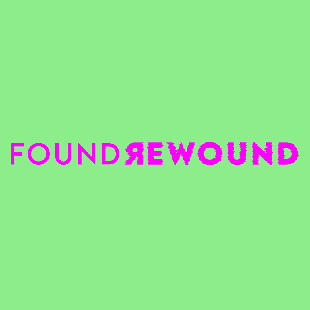
Student project focussed on a brochure design for a John Hughes tribute event hosted by the BFI. Inspired by his ground breaking, feel good coming of age movies, this concept was quickly shaped by the awkward, humourous and quirky tones to Hughes’ film genre. The colour palette aims to invoke a light hearted, comedic feeling, coupled with awkward type orientations and treatments, to really give the reader a sense of the youthful awkardness so often depicted throughout his films.
Research & Ideation

Initial brainstorming

Layout inspiration

Image treatment inspiration

Colour and typography inspiration

Layout sketches

Playing off of the contrasting, light hearted and eye catching colour palette is the use of cut out black & white film imagery. By treating the images in this way, I aimed to bring focus to the iconic moments in John Hughes’ films by making them pop, whilst interacting with the colours and typography that surround them. All of these choices, I made to bring a sense of joy, fun, nostalgia and recognition of John Hughes’ genre style across all of my design outputs.


Like what you see?
More Projects