Project Type
Deliverables
Brand Identity Design
Logo
Colour Palette
Typography
Image Treatment
Graphic Elements
Social Media Template Design
Merchandise Design
Brief
Dead Man Audio is a new guitar audio start-up launching in 2022. It’s headed up by Ed and Jack, two guys who were inspired by their experience in guitar sales and product design to create their own cutting edge guitar pickups using vintage production methods. Their aim is to speak to the idea that nothing beats that vintage guitar sound, but you don’t have to buy vintage to achieve it.
With this in mind, my challenge was to help them stand out from an already energetic guitar audio crowd in a way that felt cool, disruptive and playful, whilst staying relatable to their clientele. Equally, the owner’s were inspired by soviet propaganda imagery and wanted this to lightly inspire their aesthetic in some way. This visual inspiration conveniently related back to an era of guitar making that fuelled the inspiration for Dead Man Audio’s unique pickups, so it was down to me to create visuals that brought this history into a modern, eye catching and punchy visual language.
Research & Ideation

Visual overview of competitor, audience and client request research
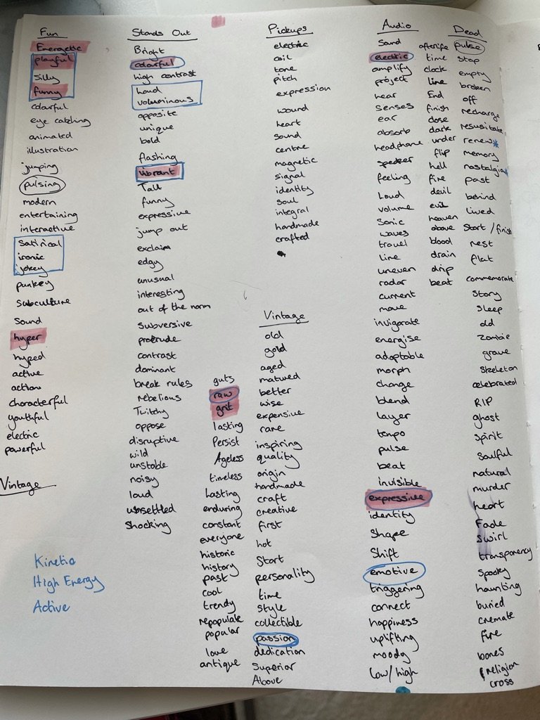
Word ideation

Brainstorming

Resulting brand values and keywords to solidify company personality

First logo sketches
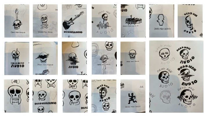
Further logo development

The MBF Taurian typeface combined everything my client wanted. In a simple sense it eludes to typefaces you may find on gravestones and gothic architecture giving a nod to the past and the literal idea of ‘Dead Man’ in the company name. It also ties in with the bold, stylised and brutalist style typography used around the 60’s in old style soviet propaganda. The type is still modern and brings an energy especially with the warp treatment to evoke a sense of expression, distortion, sound and vibration. Variables that convey what makes pickups so essential to a guitar and enables musicians to create their unique sound.


Like what you see?
More Projects